Analysis of the surface temperatures of 2023
Bernd Herd
14. Jan 2024
- 1 Abstract
- 2 Introduction
- 3 Scientific reception
- 4 Tools
- 5 Analysis of the time series
- 6 Calculation of the annual cycle
- 7 ENSO
- 8 CO2
- 9 Solar activity
- 10 Comparison
- 11 Parameters of a model
- 12 Filtering
- 13 The residual
- 14 Comparison
- 15 Filter out daytime noise
- 16 Consideration of the volcanic explosion of Mount Pinatubo
- 17 Statistics
- 18 Is global warming accelerating?
- 19 Comparison with gistemp
- 20 Reach 1.5°C
- 21 CO2 Model considerations
- 22 Outlook
- 23 Climate sensitivity
- 24 Conclusion
1 Abstract
To evaluate the striking temperature measurements of 2023, we examine the temperature measurements provided by climatereanalyzer.org and compare them with CO2, ENSO and sunspot measurements to evaluate the 2023 trend.
The measured values are indeed striking, but not as extreme as is claimed in many discussions.
2 Introduction
The global mean temperature rose almost by leaps and bounds in 2023. This has been discussed in scientific circles since June 2023. It was also explained to the public on television in connection with the floods in winter 2023.
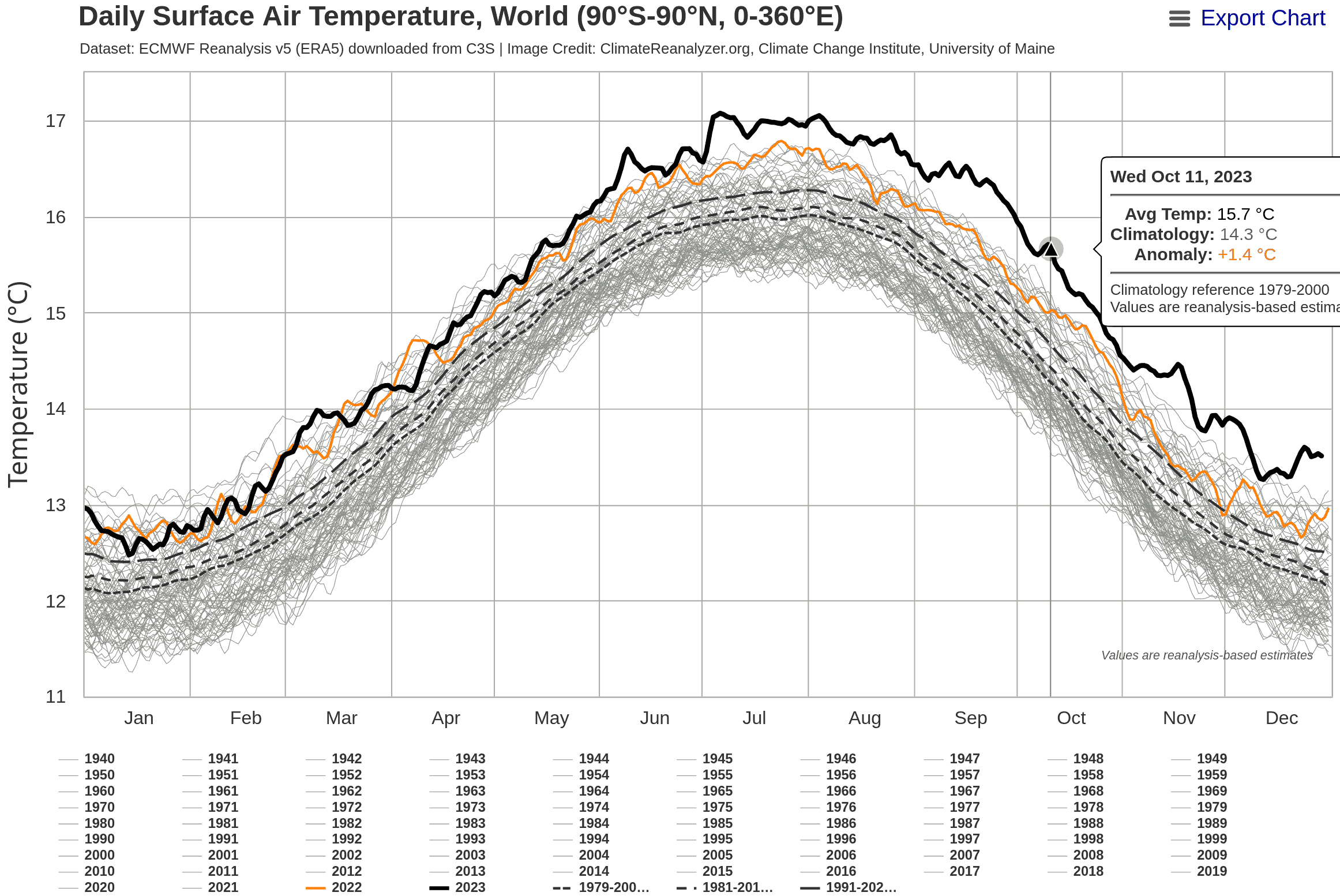
In particular, the presentation of https://climatereanalyzer.org/clim/t2_daily/?dm_id=world was posted on social media this year.
This document deals with the classification of the development of the temperature compared to previous decades by means of a mathematical analysis.
3 Scientific reception
3.1 Hansen et al.
A research group led by the famous climate scientist James Hansen has published a new 2023 scientific paper suggesting that the IPCC has grossly underestimated the Earth’s climate sensitivity. The best estimates of the IPCC are around 3°C. Hansen instead estimates the Earth’s climate sensitivity in his latest work to approx. 4.8°C. The effects of such a high climate sensitivity on humanity would be devastating.
https://academic.oup.com/oocc/article/3/1/kgad008/7335889?searchresult=1
3.2 Michael E. Mann
This work has received considerable attention in the press. There is also considerable opposition to Hansen’s work, among others by the equally famous climate scientist Michael E. Mann. He refers on Mastodon to every press article in which he contradicts Hansen’s view.
For example:
- https://www.fr.de/wissen/hansen-fachleute-warnen-erde-erwaermt-schneller-vorhersage-klimawandel-erderwaermung-james-zr-92653148.html
- https://i.stuff.co.nz/opinion/301033365/2024-the-year-it-got-really-hot
    Mann responded to Hansen’s paper within a few days of its publication in November.
    After a few ritual expressions of respect for Hansen’s record, he got down to business:
    “I feel that this latest contribution from Jim and his co-authors is at best
    unconvincing,” said Mann. (What would “at worst” be, then?)

    “I don’t think they have made the case for their main claims, i.e. that warming is
    accelerating, that the planetary heat imbalance is increasing, that aerosols are playing
    some outsized role, or that climate models are getting all of this wrong.
3.3 Gavin Schmidt
The well-known US-American climate scientist Gavin Schmidt, director of the of the GISS Institute at NASA, published an article in the Realclimate blog in early 2024.
https://www.realclimate.org/index.php/archives/2024/01/annual-gmsat-predictions-and-enso/ Wherein he:
- Confirms that the 2023 temperature was higher than his prediction for 2023 based on the ENSO forecast.
- A prediction for the mean annual temperature for 2024 of 1.38 ± 0.14°C above the 1880-1899 mean. This is 0.01°C warmer than 2023.
- The question discusses why the prediction for 2023 was so far off the mark.
- Addresses the question discussed by Hansen at al. as to whether the reduction of SO2 emissions from ocean-going shipping could have a greater influence on the mean temperature:
    We will also be seeing more comprehensive estimates of the impact of the Hunga-Tonga
    eruption, and also of the impacts of the decreases in marine shipping emissions.
    It might be that the initial estimates of their impacts were underestimated.
3.4 Tamino Blog
A mathematician has written an interesting article on the subject in his blog, which uses different methods and does not document the details in such detail, but comes to similar conclusions:
https://tamino.wordpress.com/2024/01/05/global-warming-picks-up-speed/
Hansen’’s work provides a possible explanation for the very high temperature readings in 2023. In this analysis, I try to find a well-founded opinion as to whether I tend to agree with the view of James Hansen or the view of Michael E. Mann.
4 Tools
This document is based on the software GNU R https://www.r-project.org/, which runs under Debian GNU/Linux. The source code is available from https://www.herdsoft.com/ftp/reanalyzer-2024-01-14.zip
5 Analysis of the time series
As a starting point, we load the raw JSON data from: https://www.climatereanalyzer.org/clim/t2_daily/json/era5_world_t2_day.json
library(jsonlite)
d <- fromJSON("era5_world_t2_day.json")
The data is now available in R as data.frame. Under d$name, the rows are assigned the year names are assigned to the rows. Each entry therefore contains the data for one year. The last three entries are statistical evaluations.
d$name;## [1] "1940" "1941" "1942" "1943"
## [5] "1944" "1945" "1946" "1947"
## [9] "1948" "1949" "1950" "1951"
## [13] "1952" "1953" "1954" "1955"
## [17] "1956" "1957" "1958" "1959"
## [21] "1960" "1961" "1962" "1963"
## [25] "1964" "1965" "1966" "1967"
## [29] "1968" "1969" "1970" "1971"
## [33] "1972" "1973" "1974" "1975"
## [37] "1976" "1977" "1978" "1979"
## [41] "1980" "1981" "1982" "1983"
## [45] "1984" "1985" "1986" "1987"
## [49] "1988" "1989" "1990" "1991"
## [53] "1992" "1993" "1994" "1995"
## [57] "1996" "1997" "1998" "1999"
## [61] "2000" "2001" "2002" "2003"
## [65] "2004" "2005" "2006" "2007"
## [69] "2008" "2009" "2010" "2011"
## [73] "2012" "2013" "2014" "2015"
## [77] "2016" "2017" "2018" "2019"
## [81] "2020" "2021" "2022" "2023"
## [85] "2024" "1979-2000 avg" "1981-2010 avg" "1991-2020 avg"The time series starts from 1940. First of all, we generate a plot from the raw data, which is visually similar to the visualization in Climaterealanalyzer.
plot(x=NULL, y=NULL, type='l', main='Surface temperature world', lwd=3,
     xlim=c(0, 365), ylim=c(11, 18), ylab='Temperature °C', xlab='')
grid(col = "lightgray", lty = "dotted", lwd = par("lwd"))
i=1;
while (i<length(d$name)-5) {
  lines(d$data[[i]], type='l', col='lightgray')
  i=i+1;
}
lines(d$data[[length(d$name)-5]], type='l', lwd=3, col='orange')
lines(d$data[[length(d$name)-2]], type='l', lty=5)
lines(d$data[[length(d$name)-1]], type='l', lty=2)
lines(d$data[[length(d$name)]], type='l', lty=2)
lines(d$data[[length(d$name)-4]], type='l', lwd=3)
lines(d$data[[length(d$name)-3]], type='l', lwd=3)
This illustration emphasizes very strongly how far the 2023 curve lies above all other curves. However, it is not clear whether such a rapid rise in temperature has already occurred in the past at a lower temperature level.
First, we convert the temperatures organized by year into a a continuous time series ‘timeseries’.
We determine the number of real years in variable years in such a way that the statistical data are not misinterpreted as annual data.
years = length(d$name)
while (years > 0 &&
       nchar(d$name[years])>4)
{
  years=years-1;
}

years;
## [1] 85For the first analysis, we start in 1940.
timeseries <- 0;
n <- 1;
year <- 1;
while (year <= years)
{
  year_data <- d$data[[year]];
  year_data <- year_data[ !is.na(year_data) ];

  len <- length(year_data);
  timeseries[ n:(n+len-1) ] = year_data;
  n = n + len;
  year = year + 1;
}

t <- as.numeric(d$name[[1]]) + 0:(n-2) * (1/365.25);

plot(t, timeseries, type='l', main='Surface temperature world',
     xlab='', ylab='Temperature °C')
grid(col = "lightgray", lty = "dotted", lwd = par("lwd"))
Here, the extreme of 2023 no longer looks nearly as impressive as in the illustration from clamaterealanyzer.org. But the strong annual variation hides the actual differences. We therefore form a new time series compensating for the annual variation.
6 Calculation of the annual cycle
We calculate the annual variation as an average value between 1979 and 2022.
season_sum <- rep(0, 365);
year <- 1;
n <- 0;
while (year <= years) {
   if (as.numeric(d$name[year]) >= 1979 &&
       as.numeric(d$name[year]) <= 2022) {
       season_sum = season_sum + d$data[[year]][1:365];
       n <- n + 1;
   }
   year <- year + 1;
}

season_sum[366] <- season_sum[365];
seasonal_avg <- season_sum / n;
# Calculate linear time series as anomaly compared to regular seasonal values
anomaly <- 0;
n <- 1;
year = 1;
while (year <= years)
{
year_data <- d$data[[year]];
year_data = year_data-seasonal_avg;
year_data <- year_data[ !is.na(year_data) ];
len <- length(year_data);
anomaly[ n:(n+len-1) ] = year_data;
n = n + len;
year = year + 1;
}
plot(t, anomaly, type='l',
main='Surface temperature with compensation of the annual cycle',
ylab='Temperature °C', xlab='');
grid(col = "lightgray", lty = "dotted", lwd = par("lwd"))
These values are relative to the average value from 1981-2010, not the pre-industrial values, which are the basis of the Paris Climate Accord. Compare Stefan Rahmstorf https://scilogs.spektrum.de/klimalounge/2-grad-relativ-zu-wann/
In order to determine the difference between the mean values 1981-2010 and the mean values at the the beginning of industrialization, we need a time series that contains older values.
We use the period from 1880 to 1899 as the base value for our temperatures, because Gavin Schmidt used this in his blog post.
We load the Gistemp data from NASA as a file from https://data.giss.nasa.gov/gistemp/tabledata_v4/GLB.Ts+dSST.txt and calculate the warming for the period 1880 to 1899 and 1979 to 2022:
giss <- read.table(pipe("egrep '^18|^19|^20' GLB.Ts+dSST.txt"), sep="", header=F);
giss$year <- as.numeric(giss$V1); giss$V1 <- NULL; giss$V20 <- NULL;
giss$j_d <- as.numeric(giss$V14)*0.01; giss$V14 <- NULL; giss$V15 <- NULL;
giss$jan <- as.numeric(giss$V2)*0.01; giss$V2 <- NULL;
giss$feb <- as.numeric(giss$V3)*0.01; giss$V3 <- NULL;
giss$mar <- as.numeric(giss$V4)*0.01; giss$V4 <- NULL;
giss$apr <- as.numeric(giss$V5)*0.01; giss$V5 <- NULL;
giss$may <- as.numeric(giss$V6)*0.01; giss$V6 <- NULL;
giss$jun <- as.numeric(giss$V7)*0.01; giss$V7 <- NULL;
giss$jul <- as.numeric(giss$V8)*0.01; giss$V8 <- NULL;
giss$aug <- as.numeric(giss$V9)*0.01; giss$V9 <- NULL;
giss$sep <- as.numeric(giss$V10)*0.01; giss$V10<- NULL;
giss$oct <- as.numeric(giss$V11)*0.01; giss$V11<- NULL;
giss$nov <- as.numeric(giss$V12)*0.01; giss$V12<- NULL;
giss$dec <- as.numeric(giss$V13)*0.01; giss$V13<- NULL;
mean_1880_1899 <- mean(giss$j_d[(1880-1880+1):(1899-1880+1)]);
mean_1951_1980 <- mean(giss$j_d[(1951-1880+1):(1980-1880+1)]);
mean_1979_2022 <- mean(giss$j_d[(1979-1880+1):(2022-1880+1)]);
difference_1979_1880 <- mean_1979_2022 - mean_1880_1899;
data.frame(mean_1880_1899, mean_1979_2022, difference_1979_1880);
## mean_1880_1899 mean_1979_2022 difference_1979_1880
## 1 -0.222 0.5268182 0.7488182anomaly = anomaly + difference_1979_1880;
plot(t, anomaly, type='l',
main='Surface temperature with reference temperature 1880 to 1899',
ylab='Temperature °C', xlab='');
grid(col = "lightgray", lty = "dotted", lwd = par("lwd"))
As can be seen, the global temperature began to rise steadily from around 1975. For further consideration, we will only evaluate the data from 1979 onwards, because the ENSO index data is only available starting from this period.
startyear = 1;
while (startyear < years &&
       d$name[startyear] != "1979")
{
  startyear=startyear+1;
}
startyear;
## [1] 40anomaly <- 0;
n <- 1;
year = startyear;
while (year <= years)
{
year_data <- d$data[[year]];
year_data = year_data-seasonal_avg;
year_data <- year_data[ !is.na(year_data) ];
len <- length(year_data);
anomaly[ n:(n+len-1) ] = year_data;
n = n + len;
year = year + 1;
}
anomaly = anomaly + difference_1979_1880;
t <- as.numeric(d$name[[startyear]]) + 0:(n-2) * (1/365.25)
plot(t, anomaly, type='l',
main='Surface temperature with compensation of the annual cycle',
ylab='Temperature °C', xlab='');
grid(col = "lightgray", lty = "dotted", lwd = par("lwd"))
First of all, it is not surprising that with a steadily increasing CO2 content in the atmosphere, the temperature rises steadily. It is striking that the temperature rise in 2023 looks very similar to the temperature rise in 1998:
par(mfcol=c(1, 2));
plot(t, anomaly, xlim=c(1996+0.3,1998+0.3), type='l', ylab='', xlab='', ylim=c(0.8-0.6,2.0-0.6));
plot(t, anomaly, xlim=c(2022    ,2024    ), type='l', ylab='', xlab='', ylim=c(0.8    ,2.0))
par(mfcol=c(1,1));The reason for this is that both 1998 and 2023 were years with a strong ENSO (El Niño Southern Oscillation).
7 ENSO
Since 1979 there have been time series records on the status of the El Niño Southern Oscilation. We download these from: https://psl.noaa.gov/enso/mei/data/meiv2.data
We then form a time series with days from 1979 onwards.
raw_enso <- read.table(pipe("tail --lines=+2 meiv2.data|egrep '^19|^20'"),
                       sep="", header=F);
raw_enso$year <- raw_enso$V1; raw_enso$V1 <- NULL;

enso <- 1;

i = 1; # raw_enso$year[1] == 1979
n = 1
while (i <= length(raw_enso$year))
{
    enso[n:(n+30)] <- rep(raw_enso$V2[i], 31); n <- n+31; # January
    if ( (raw_enso$year[i] %% 4) == 0 ) {
        enso[n:(n+28)] <- rep(raw_enso$V3[i], 29); n <- n+29; # February
    } else {
        enso[n:(n+27)] <- rep(raw_enso$V3[i], 28); n <- n+28; # February
    };
    enso[n:(n+30)] <- rep(raw_enso$V4[i], 31); n <- n+31; # March
    enso[n:(n+29)] <- rep(raw_enso$V5[i], 30); n <- n+30; # April
    enso[n:(n+30)] <- rep(raw_enso$V6[i], 31); n <- n+31; # May
    enso[n:(n+29)] <- rep(raw_enso$V7[i], 30); n <- n+30; # June
    enso[n:(n+30)] <- rep(raw_enso$V8[i], 31); n <- n+31; # July
    enso[n:(n+30)] <- rep(raw_enso$V9[i], 31); n <- n+31; # August
    enso[n:(n+29)] <- rep(raw_enso$V10[i], 30); n <- n+30; # September
    enso[n:(n+30)] <- rep(raw_enso$V11[i], 31); n <- n+31; # October
    enso[n:(n+29)] <- rep(raw_enso$V12[i], 30); n <- n+30; # November
    enso[n:(n+30)] <- rep(raw_enso$V13[i], 31); n <- n+31; # December
    i = i+1;
}

# Fill up ENSO Vector if it is shorter
if (length(enso) < length(anomaly)) {
   enso[(length(enso)+1):length(anomaly)] <- enso[length(enso)]
}
enso <- enso[ 1:(length(anomaly)) ];

plot(t, enso, main='El Niño Southern Oscillation Index', type='l');
grid(col = "lightgray", lty = "dotted", lwd = par("lwd"))
It is worth noting that an El Niño began to develop in 2023, However, the index is only slightly positive so far, far lower than in 2016 or even 1998. 2023 therefore has not classified as an El Niño year by scientists.
8 CO2
We download the change in the CO2 content in the atmosphere from ftp://ftp.cmdl.noaa.gov/ccg/co2/trends/co2_weekly_mlo.csv The file contains weekly data on the concentration of CO2 measured on Mauna Loa. There are gaps in the record that we need to fill in when converting to a time series.
co2_weekly <- read.table(pipe("grep -v '^#' co2_weekly_mlo.csv"), sep=",", header=T);
co2 <- rep(0,8);
i <- 1;
n <- 1;

while (i <= length(co2_weekly$decimal))
{
    if (co2_weekly$decimal[i] > 1979)
    {
        x <- (co2_weekly$decimal[i] - 1979) * 365.25;
        if (co2_weekly$average[i]>0) {
            co2[x:(x+7)] = rep(co2_weekly$average[i], 8);
        } else {
            co2[x:(x+7)] = rep(co2[length(co2)], 8);
        }
    }

    i = i+1;
}

co2[1:6] <- rep(co2[7],6);
co2 <- co2[1:(length(anomaly))];
plot(t, co2, main='CO~2~ concentratin in parts per million', type='l');
grid(col = "lightgray", lty = "dotted", lwd = par("lwd"))
9 Solar activity
Another known factor influencing the Earth’s temperature is solar activity, the strength of which typically follows an 11-year cycle. Solar activity can be roughly estimated from the number of sunspots.
We download this data from http://www.sidc.be/silso/DATA/SN_y_tot_V2.0.txt and and convert it into a daily time series.
library(interp);
sun_yearly <- read.table(pipe("sed 's/\\*$//' SN_y_tot_V2.0.txt"), sep="", header=F);
sun_yearly$year <- sun_yearly$V1;  sun_yearly$V1<-NULL;
sun_yearly$sunspots <- sun_yearly$V2;  sun_yearly$V2<-NULL;

sunspots <- aspline((1979-sun_yearly$year[1]+1):(length(sun_yearly$year)), sun_yearly$sunspots[280:(length(sun_yearly$year))], n=length(anomaly))$y;
plot(t, sunspots, main='Number of sunspots', type='l', lwd=3);
grid(col = "lightgray", lty = "dotted", lwd = par("lwd"))
10 Comparison
To compare the influencing variables, we convert the data into a data.frame and use xyplot from the Lattice package. The selected factors are initially completely arbitrary.
library(lattice);
df <- data.frame(t, anomaly, enso, co2, sunspots)
xyplot(anomaly+enso*0.1+(log(co2/280)-0.1)*4+(sunspots*0.001)~t, data = df, ylab='',
       main = 'Comparison of influencing variables', type='l', auto.key=TRUE);
11 Parameters of a model
In order to recognize whether there was an unknown influencing factor in 2023 for the mean sea temperature, we use a mathematical model to determine how well the measured temperatures can be derived from the already known influencing factors.
We model the dependency of the temperature on the CO2 content of the atmosphere logarithmically, because the heat change increases approximately logarithmically with the CO2 concentration. A doubling of the CO2 concentration from 280 to 560ppm therefore is expected to cause the same warming as a doubling from 580 to 1260ppm.
tfit <- nls(anomaly ~ A + B*log(co2/280) + C*enso +D*sunspots, data = df,
            start = list( A=mean(df$anomaly), B=0.01, C=0, D=0) );
tfit;
## Nonlinear regression model
## model: anomaly ~ A + B * log(co2/280) + C * enso + D * sunspots
## data: df
## A B C D
## -0.5633851 4.4468385 0.0599070 0.0005403
## residual sum-of-squares: 485.7
##
## Number of iterations to convergence: 1
## Achieved convergence tolerance: 1.579e-07plot(df$t, df$anomaly, type='l', col='blue', lwd=1, xlab='');
grid(col = "lightgray", lty = "dotted", lwd = par("lwd"))
lines(predict(tfit) ~ df$t, type='l', col="darkgreen", lwd=3);
The green line is now the estimated value for the expected temperature based on the parameters (CO2, ENSO, Sunspots) and the blue line is the measured temperature.
12 Filtering
It can be seen that low-pass filtering of the values of ENSO and CO2 improves the model slightly. The “residual sum-of-squares” value in the NLS result becomes smaller as a result.
We use a simple IIR filter (Infinite Impulse Response) for filtering:
lowpass <- function(inp, lambda) {

value <- mean(inp[1:10]);
result <- 0;
i <- 1;
while (i<=length(inp))
{
    value = value*(1-lambda) + inp[i]*lambda;
    result[i] = value;
    i = i+1;
}

result;
}
Now we add filtered values for enso and co2 in the dataframe df:
df$fco2 <- lowpass(df$co2, 0.012);
df$fenso <- lowpass(df$enso, 0.012);

# Shift of ENSO by 40 days, i.e. effect is 40 days later than cause
df$fenso <-c( rep(0, 40),
              df$fenso[ 1:(length(df$fenso)-40) ]
            );
And we are updating our model:
ffit <- nls(anomaly ~ A + B*log(fco2/280) + C*fenso +D*sunspots, data = df,
            start = list( A=mean(df$anomaly), B=0.01, C=0, D=0) );
ffit;
## Nonlinear regression model
## model: anomaly ~ A + B * log(fco2/280) + C * fenso + D * sunspots
## data: df
## A B C D
## -0.6329335 4.6745895 0.0894879 0.0006708
## residual sum-of-squares: 447.3
##
## Number of iterations to convergence: 1
## Achieved convergence tolerance: 1.121e-07plot(df$t, df$anomaly, type='l', col='blue', lwd=1);
grid(col = "lightgray", lty = "dotted", lwd = par("lwd"))
lines(predict(ffit) ~ df$t, type='l', col="darkgreen", lwd=3);
13 The residual
The part of the measurement result that cannot be derived from the input values according to the input values looks like this:
residuum <- anomaly - predict(ffit);
plot(df$t, residuum, type='l', col='blue', lwd=1);
grid(col = "lightgray", lty = "dotted", lwd = par("lwd"))
So this is the part of the measurement that cannot be derived from CO2, ENSO and sunspots. Here, the high measurement result of 2023 no longer looks nearly as impressive impressive as in the original visualization.
14 Comparison
fval<-coef(ffit);
xyplot(anomaly+(log(fco2/280)*fval[2]+fval[1])+fenso*fval[3]+sunspots*fval[4]~t, data = df,
       xlab='', ylab='Temperature °C',
       main = 'Comparison of influencing variables', type='l', auto.key=TRUE);
15 Filter out daytime noise
Since the noise makes the plot difficult to recognize, we apply low-pass filtering to the “anomaly” measured values, to obtain a smoother plot:
df$fanomaly <- lowpass(df$anomaly, 0.025);
xyplot(fanomaly+(log(fco2/280)*fval[2]+fval[1])+fenso*fval[3]+sunspots*fval[4]~t, data = df,
       main = 'Comparison of influencing variables', type='l', auto.key=TRUE,
       ylab = 'Temperature °C', xlab='');
The same for the residual
fresiduum <- lowpass(residuum, 0.025);
plot(df$t, fresiduum, type='l', col='blue', lwd=1, xlab='');
grid(col = "lightgray", lty = "dotted", lwd = par("lwd"))
The weirdness of 2023 therefore no longer looks so impressive.
16 Consideration of the volcanic explosion of Mount Pinatubo
Much more striking in the residual is the sharp drop in temperature towards 1992. The cause of this is known: The volcano Mount Pinatubo exploded and its emissions cooled the earth at that time. James Hansen correctly predicted this cooling as a result of the explosion.
- https://www.e-education.psu.edu/meteo469/?q=book/export/html/141
- https://pubs.giss.nasa.gov/abs/ha00800v.html
The data is a rough version of the plot from the Hansen paper of 1991.
y <- 0:8 * 0.42 + 1991.5;
raw_pinatubo <- c(0, 1.7, 4.5, 3, 2, 1.5, 1, 0.4, 0);
npinatubo <- as.integer((y[length(y)]-y[1]+1) * 365.25);
spinatubo <- as.integer( ((1991.5-1979)*365.25 ) )+1;
pinatubo <- rep(0, length(anomaly));
pinatubo[spinatubo:(spinatubo+npinatubo-1)] <- aspline(y, raw_pinatubo, n=npinatubo)$y;
df$pinatubo <- pinatubo;

pfit <- nls(anomaly ~ A + B*log(fco2/280) + C*fenso +D*sunspots + E*pinatubo, data = df,
            start = list( A=mean(df$anomaly), B=0.01, C=0, D=0, E=-0.01) );
pfit;
## Nonlinear regression model
## model: anomaly ~ A + B * log(fco2/280) + C * fenso + D * sunspots + E * pinatubo
## data: df
## A B C D E
## -0.5880917 4.5828593 0.1080107 0.0006449 -0.0888112
## residual sum-of-squares: 395
##
## Number of iterations to convergence: 1
## Achieved convergence tolerance: 1.225e-07pval <- coef(pfit);
xyplot(fanomaly+(log(fco2/280)*pval[2]+pval[1])+fenso*pval[3]+sunspots*pval[4]+pinatubo*pval[5]~t, data = df,
main = 'Comparison of influencing variables', type='l', auto.key=TRUE,
ylab = 'Temperature °C', xlab='');
residuum <- anomaly - predict(pfit);
fresiduum <- lowpass(residuum, 0.025);

plot(df$t, fresiduum, type='l', col='blue', lwd=1,
     xlab='', ylab='°C', main='Residuum filtered with Mount Pinatubo');
grid(col = "lightgray", lty = "dotted", lwd = par("lwd"))
17 Statistics
The standard deviation of the residual is:
standard_deviation = sd(residuum);
standard_deviation;
## [1] 0.1549931The highest value of the residual is therefore in standard deviations (sigma):
max(residuum / standard_deviation);## [1] 4.040583min(residuum / standard_deviation);## [1] -3.897471The probability that one value in a measurement series reaches this value is:
pnorm(-max(residuum)/standard_deviation);## [1] 2.665919e-05Initially that looks very little, but our time series also contains measurements for each day from several decades. Accordingly, it is to be expected that this maximum value on average to
pnorm(-max(residuum)/standard_deviation) * length(residuum);## [1] 0.4383838days is reached.
A value of +0.5 degrees was reached at:
sum(residuum > 0.5)## [1] 24days.
According to the statistics:
pnorm(-0.5/standard_deviation) * length(residuum);## [1] 10.32319The observed temperature trend is in °C per decade:
plot(df$t, df$fanomaly, type='l', main='After removing seasonal average');

lmAnomaly <- lm(anomaly ~ t)
abline(lmAnomaly);
coef(lmAnomaly)[2]*10## t
## 0.197279118 Is global warming accelerating?
James Hansen’s work claims that global warming has accelerated in recent years, especially since SO2 emissions have been reduced in recent years.
It turns out that, depending on the time periods chosen, the impression can be created that warming has accelerated significantly, or that there has been no significant change:
plot_line <- function(dataframe, col) {
lm <- lm(dataframe$anomaly ~ dataframe$t)
co <- coef(lm);
lines(c(dataframe$t[1], dataframe$t[length(dataframe$t)]),
      c(co[1] + co[2] * dataframe$t[1], c(co[1] + co[2] * dataframe$t[length(dataframe$t)])),
      col=col);
print( sprintf("From %.0f to %.0f %.2f °C per decade",
               dataframe$t[1], dataframe$t[length(dataframe$t)], co[2]*10) );
}
plot(df$t, df$fanomaly, type='l', main='Global warming occurs at a constant rate');
abline(lmAnomaly, col='yellow', lwd=2);
plot_line(subset(df, t>1994 & t<2004), 'green');## [1] "From 1994 to 2004 0.28 °C per decade"plot_line(subset(df, t>2004 & t<2024), 'green');## [1] "From 2004 to 2024 0.28 °C per decade"plot_line(subset(df, t>2014 & t<2024), 'blue');
## [1] "From 2014 to 2024 0.27 °C per decade"plot(df$t, df$fanomaly, type='l', main='Global warming is accelerating');
abline(lmAnomaly, col='yellow', lwd=2);
plot_line(subset(df, t<2000), 'red');## [1] "From 1979 to 2000 0.11 °C per decade"plot_line(subset(df, t>1990 & t<2010), 'red');## [1] "From 1990 to 2010 0.19 °C per decade"plot_line(subset(df, t>2000 & t<2020), 'red');## [1] "From 2000 to 2020 0.25 °C per decade"plot_line(subset(df, t>2004 & t<2024), 'red');## [1] "From 2004 to 2024 0.28 °C per decade"plot_line(subset(df, t>2010 & t<2024), 'red');
## [1] "From 2010 to 2024 0.35 °C per decade"However, periods of more than 20 years are only less than 0.2°C per decade if they are very early.
19 Comparison with gistemp
To compare the climatereanalyzer.org data with the gistemp data from NASA, we use the monthly data from the gistemp dataset.
The data from Climetereanalyzer.org as daily data is much more noisy than the monthly gistemp data. To make them comparable, we calculate the monthly averages from them.
i = 1;
n = 1;
mon_gistemp <- 0;

while (i <= length(giss$year))
{
  if (giss$year[i] >= 1979) {
    mon_gistemp[n] <- giss$jan[i]; n<-n+1;
    mon_gistemp[n] <- giss$feb[i]; n<-n+1;
    mon_gistemp[n] <- giss$mar[i]; n<-n+1;
    mon_gistemp[n] <- giss$apr[i]; n<-n+1;
    mon_gistemp[n] <- giss$may[i]; n<-n+1;
    mon_gistemp[n] <- giss$jun[i]; n<-n+1;
    mon_gistemp[n] <- giss$jul[i]; n<-n+1;
    mon_gistemp[n] <- giss$aug[i]; n<-n+1;
    mon_gistemp[n] <- giss$sep[i]; n<-n+1;
    mon_gistemp[n] <- giss$oct[i]; n<-n+1;
    mon_gistemp[n] <- giss$nov[i]; n<-n+1;
    mon_gistemp[n] <- giss$dec[i]; n<-n+1;
  }
  i = i+1;
}
# gistemp data is based on 1951-1980 average, rebase to 1880-1899 average
mon_gistemp <- mon_gistemp - (mean_1880_1899 - mean_1951_1980);

day2mon <- function(daily) {

year <- 1979;
dst <- 1;
mon <- 0;
src <- 1;
while (src < length(daily))
{
    mon[dst] <- mean( daily[src:(src+30)] ); src<-src+31; # January
    if ( (year %% 4) == 0 ) {
       mon[dst+1] <- mean( daily[src:(src+28)] ); src<-src+29; # February
    } else {
       mon[dst+1] <- mean( daily[src:(src+27)] ); src<-src+28; # February
    }
    mon[dst+2] <- mean( daily[src:(src+30)] ); src<-src+31; # March
    mon[dst+3] <- mean( daily[src:(src+29)] ); src<-src+30; # April
    mon[dst+4] <- mean( daily[src:(src+30)] ); src<-src+31; # May
    mon[dst+5] <- mean( daily[src:(src+29)] ); src<-src+30; # June
    mon[dst+6] <- mean( daily[src:(src+30)] ); src<-src+31; # July
    mon[dst+7] <- mean( daily[src:(src+30)] ); src<-src+31; # August
    mon[dst+8] <- mean( daily[src:(src+29)] ); src<-src+30; # September
    mon[dst+9] <- mean( daily[src:(src+30)] ); src<-src+31; # October
    mon[dst+10]<- mean( daily[src:(src+29)] ); src<-src+30; # November
    mon[dst+11]<- mean( daily[src:(src+30)], na.rm=TRUE); src<-src+31; # December
    dst <- dst+12;
    year <- year+1;
}
mon;
}

mon_anomaly <- day2mon(anomaly);
mon_anomaly <- mon_anomaly[1:length(mon_gistemp)];

mon <- 1979 + (0:(length(mon_anomaly)-1)) / 12;
mon = data.frame(mon, mon_anomaly, mon_gistemp);
xyplot(mon_anomaly+mon_gistemp~mon, data = mon, ylab='°C',
       main = 'Comparison of climatereanalyzer with gistemp', type=c('l','g'), auto.key=TRUE);
xyplot(mon_anomaly+mon_gistemp~mon, data = mon, ylab='°C',
       main = 'Comparison of climatereanalyzer with gistemp, cutout', type=c('l','g'),
       auto.key=TRUE, xlim=c(2010,2024));
19.1 Model based on gistemp data
Accordingly, on the basis of the gistemp data we can also calculate a model based on CO2, ENSO and sunspots:
mon_enso <- 1;

i = 1; # raw_enso$year[1] == 1979
n = 0;
while (i <= length(raw_enso$year))
{
    mon_enso[(n+1)] <- raw_enso$V2[i];
    mon_enso[(n+2)] <- raw_enso$V3[i];
    mon_enso[(n+3)] <- raw_enso$V4[i];
    mon_enso[(n+4)] <- raw_enso$V5[i];
    mon_enso[(n+5)] <- raw_enso$V6[i];
    mon_enso[(n+6)] <- raw_enso$V7[i];
    mon_enso[(n+7)] <- raw_enso$V8[i];
    mon_enso[(n+8)] <- raw_enso$V9[i];
    mon_enso[(n+9)] <- raw_enso$V10[i];
    mon_enso[(n+10)] <- raw_enso$V11[i];
    mon_enso[(n+11)] <- raw_enso$V12[i];
    mon_enso[(n+12)] <- raw_enso$V13[i];
    i <- i+1;
    n <- n+12;
}

mon$mon_enso <- mon_enso;
mon$mon_co2 <- day2mon(co2)[1:length(mon_gistemp)];
mon$mon_sunspots <- day2mon(sunspots)[1:length(mon_gistemp)]
mon$mon_pinatubo <- day2mon(pinatubo)[1:length(mon_gistemp)];

mfit <- nls(mon_gistemp ~ A + B*log(mon_co2/280) + C*mon_enso +D*mon_sunspots +E*mon_pinatubo, data=mon,
            start = list( A=mean(mon$mon_anomaly), B=0.01, C=0, D=0, E=-0.1) );
mfit;
## Nonlinear regression model
## model: mon_gistemp ~ A + B * log(mon_co2/280) + C * mon_enso + D * mon_sunspots + E * mon_pinatubo
## data: mon
## A B C D E
## -0.4834763 4.2304266 0.0650226 0.0004601 -0.0655844
## residual sum-of-squares: 8.382
##
## Number of iterations to convergence: 1
## Achieved convergence tolerance: 1.062e-06plot(mon$mon, mon$mon_gistemp, type='l', col='blue', lwd=1,
main='Model based on gistemp data', xlab='', ylab='°C');
grid(col = "lightgray", lty = "dotted", lwd = par("lwd"))
lines(predict(mfit) ~ mon$mon, type='l', col="darkgreen", lwd=3);
monval<-coef(mfit);
xyplot(mon_gistemp+(log(mon_co2/280)*monval[2]+monval[1])+mon_enso*monval[3]+mon_sunspots*monval[4]+mon_pinatubo*monval[5]~mon,
       data=mon, xlab='', ylab='°C',
       main = 'Comparison of influencing variables gistemp', type=c('g','l'), auto.key=TRUE);
19.2 Residuum gistemp
gistemp_residuum <- mon$mon_gistemp - predict(mfit);
plot(mon$mon, gistemp_residuum, type='l', col='blue', lwd=1, xlab='');
grid(col = "lightgray", lty = "dotted", lwd = par("lwd"))
19.3 Statsitik gistemp
In the gistemp data, the residual of the ENSO event of 2016 is even larger than that of 2023. We therefore only evaluate the maximum value for 2023 in the statistics:
sd(gistemp_residuum);## [1] 0.1247037max(gistemp_residuum);## [1] 0.4156917# Maximum value for 2023
gmax <- max(gistemp_residuum[(length(gistemp_residuum)-12):(length(gistemp_residuum))]);
gmax;## [1] 0.3918975gmax / sd(gistemp_residuum);## [1] 3.142629pnorm(-gmax/sd(gistemp_residuum)) * length(gistemp_residuum);## [1] 0.4520818This means that a month with this maximum value since 1979 is slightly unlikely, but not impossible.
20 Reach 1.5°C
In 2023, the maximum temperature increase stipulated in the Paris Climate Agreement as a maximum value of 1.5°C has already been exceeded for a short time. However, this short-term exceedance does not yet violate the targets of the agreement.
Based on the average rate of warming over the last few decades it is possible to estimate when the 1.5°C target of the Paris Climate Climate Agreement will be permanently missed.
plot(df$t, df$fanomaly, col='blue', type='l', xlab='', ylab='°C',
     xlim=c(1979, 2065), ylim=c(0, 2.5),
     main='Expected warming');
grid(col = "lightgray", lty = "dotted", lwd = par("lwd"))
abline(lmAnomaly);
abline(h='1.5', col='gray');
abline(h='2.0', col='gray');

lmAnomaly;
##
## Call:
## lm(formula = anomaly ~ t)
##
## Coefficients:
## (Intercept) t
## -38.72130 0.01973# Target exceeded by 1.5°C
t15 <- (1.5-coef(lmAnomaly)[1]) / coef(lmAnomaly)[2]
t15;## (Intercept)
## 2038.802# Target exceeded 2.0°C
t20 <- (2.0-coef(lmAnomaly)[1]) / coef(lmAnomaly)[2]
t20;## (Intercept)
## 2064.147abline(v=t15, lty=2);
abline(v=t20, lty=2);
text(t15, 0, sprintf('%.1f', t15));
text(t20, 0, sprintf('%.1f', t20));
Under the pessimistic assumption that James Hansen is right, and global warming had accelerated considerably, the target would be missed more quickly. Hansen et. al. give their view of warming from 2010 as at least 0.27°C per decade :
plot(df$t, df$fanomaly, col='blue', type='l', xlab='', ylab='°C',
     xlim=c(1979, 2065), ylim=c(0, 2.5),
     main='Expected value warming Hansen');
grid(col = "lightgray", lty = "dotted", lwd = par("lwd"))
abline(h='1.5', col='gray');
abline(h='2.0', col='gray');
shansen <- subset(df, t>2010);
#lmHansen = lm(anomaly ~ t, data=shansen);
#lmHansen;
#co <- coef(lmHansen);
hansen_co2 <- 0.27/10;
hansen_co1 <- mean(shansen$anomaly)-mean(c(shansen$t[1], shansen$t[length(shansen$t)]))*hansen_co2;
co <- c(hansen_co1, hansen_co2);
# Target exceeded 1.5°C
h15 <- (1.5-co[1]) / co[2];
h15;
## [1] 2032.141# Target exceeded 2.0°C
h20 <- (2.0-co[1]) / co[2]
h20;## [1] 2050.659lines(c(shansen$t[1], 2070),
c(co[1] + co[2] * shansen$t[1], co[1] + co[2] * 2070),
col='darkred');
lines(c(shansen$t[1], shansen$t[length(shansen$t)]),
c(mean(shansen$anomaly), mean(shansen$anomaly)),
col='gray', lty=2);
abline(v=h15, lty=2, col='darkred');
abline(v=h20, lty=2, col='darkred');
text(h15, 0, sprintf('%.1f', h15), col='darkred');
text(h20, 0, sprintf('%.1f', h20), col='darkred');
21 CO2 Model considerations
According to the model calculations, the measured temperature is mainly influenced by CO2 emissions. ENSO and sunspots are cyclical phenomena where no long-term trend can be expected.
We therefore take a closer look at the CO2 levels in order to make more precise statements about the development of warming.
The CO2 level in the atmosphere is mainly increased by new emissions. It is therefore the integral of global emissions. The annual emissions have increased in recent decades, therefore a linear model for CO2 emissions is not sufficient.
co2fit <- nls(co2 ~ A + B*t + C*t*t, data = df,
            start = list( A=400, B=0.01, C=0) );
co2fit;
## Nonlinear regression model
## model: co2 ~ A + B * t + C * t * t
## data: df
## A B C
## 6.001e+04 -6.148e+01 1.583e-02
## residual sum-of-squares: 87251
##
## Number of iterations to convergence: 2
## Achieved convergence tolerance: 3.806e-06plot(df$t, df$co2, main="Historical CO2 measurements and model", type='l', xlab='');
grid(col = "lightgray", lty = "dotted", lwd = par("lwd"))
lines(df$t, predict(co2fit), col='darkgreen');
abline(lm(co2~t, data=df), col='darkred');
The red line is a linear model and does not fit the measurements well. The green line is a quadratic model and fits the measurements well.
The CO2 concentration as a function of time is represented as: \[co2 = A + B t + C t^2\]
With
\[\begin{align*} temp &= \ln(co2) \cdot fval[2] \\ &= \ln(A + B t + C t^2) \cdot fval[2] \\ \end{align*}\]
Is therefore the gradient and thus the temperature increase per year:
\[\begin{align*} \frac{dtemp}{dt} &= fval[2] \cdot \frac{1}{A + B t + C t^2} \cdot (B + 2 \cdot C \cdot t) \\ &= fval[2] \cdot \frac{B + 2 \cdot C \cdot t}{A + B t + C t^2} \\ \end{align*}\]
This means that for the time t=2024 the expected temperature increase is per decade:
tnow <- 2024
per1 <- fval[2] * (coef(co2fit)[2] + 2 * coef(co2fit)[3] * tnow) /
                  (coef(co2fit)[1] + coef(co2fit)[2]*tnow + coef(co2fit)[3]*tnow^2);
per1*10;
## B
## 0.2872883This is even higher than the values of James Hansen et al.
plot(df$t, df$fanomaly, col='blue', type='l', xlab='', ylab='°C',
     xlim=c(1979, 2065), ylim=c(0, 2.5),
     main='Expected warming CO2 model');
grid(col = "lightgray", lty = "dotted", lwd = par("lwd"))
abline(h='1.5', col='gray');
abline(h='2.0', col='gray');
model_co2 <- per1;
model_co1 <- mean(shansen$anomaly)-mean(c(shansen$t[1], shansen$t[length(shansen$t)]))*model_co2;
co <- c(model_co1, model_co2);
# Target exceeded 1.5°C
m15 <- (1.5-co[1]) / co[2];
# Target exceeded 2.0°C
m20 <- (2.0-co[1]) / co[2]
data.frame(m15, m20);
## m15 m20
## B 2031.23 2048.634lines(c(shansen$t[1], 2070),
c(co[1] + co[2] * shansen$t[1], co[1] + co[2] * 2070),
col='red');
abline(v=m15, lty=2, col='red');
abline(v=m20, lty=2, col='red');
lines(df$t, fval[1]+log(predict(co2fit)/280)*fval[2], col='darkgreen');
text(m15, 0, sprintf('%.1f', m15), col='red');
text(m20, 0, sprintf('%.1f', m20), col='red');
Instead of the CO2 coefficient of the model as CO2, ENSO and sunspots, we can also calculate a model based only on CO2:
ofit <- nls(anomaly ~ A + B*log(fco2/280), data = df,
            start = list( A=mean(df$anomaly), B=0.01) );
#ofit <- ffit;
ofit;
## Nonlinear regression model
## model: anomaly ~ A + B * log(fco2/280)
## data: df
## A B
## -0.3797 3.9707
## residual sum-of-squares: 548.7
##
## Number of iterations to convergence: 1
## Achieved convergence tolerance: 4.998e-08oval=coef(ofit);
oper1 <- oval[2] * (coef(co2fit)[2] + 2 * coef(co2fit)[3] * tnow) /
(coef(co2fit)[1] + coef(co2fit)[2]*tnow + coef(co2fit)[3]*tnow^2);
oper1*10;## B
## 0.244028plot(df$t, df$fanomaly, col='blue', type='l', xlab='', ylab='°C',
xlim=c(1979, 2065), ylim=c(0, 2.5),
main='Expected warming CO2 model');
grid(col = "lightgray", lty = "dotted", lwd = par("lwd"))
abline(h='1.5', col='gray');
abline(h='2.0', col='gray');
co2co<-coef(co2fit);
model_co2 <- oper1;
#model_co1 <- mean(shansen$anomaly)-mean(c(shansen$t[1], shansen$t[length(shansen$t)]))*model_co2;
#model_co1 <- oval[1] + oval[2] * (co2co[1]+co2co[2]*2024+co2co[3]*2024^2) - 2024*model_co2;
model_co1 <- oval[1] + oval[2] * log((co2co[1]+co2co[2]*2024+co2co[3]*2024^2)/280) - 2024*model_co2;
co <- c(model_co1, model_co2);
# Target exceeded 1.5°C
o15 <- (1.5-co[1]) / co[2];
# Target exceeded 2.0°C
o20 <- (2.0-co[1]) / co[2]
data.frame(o15, o20);## o15 o20
## A 2034.115 2054.604lines(c(shansen$t[1], 2070),
c(co[1] + co[2] * shansen$t[1], co[1] + co[2] * 2070),
col='red');
abline(v=o15, lty=2, col='red');
abline(v=o20, lty=2, col='red');
lines(df$t, oval[1]+log(predict(co2fit)/280)*oval[2], col='darkgreen');
lines(df$t, predict(ofit));
text(o15, 0, sprintf('%.1f', o15), col='red');
text(o20, 0, sprintf('%.1f', o20), col='red');
22 Outlook
During a strong El Niño event, the ENSO index has so far reached values of up to 2.89. Values of 2.5 have occurred on 181 days since the start of the time series in 1979. At the end of 2023, the ENSO index is 0.81. An increase from 0.81 to 2.5 results in an additional temperature increase via the pfit model:
delta_enso <- 2.5 - enso[length(enso)];
delta_temp <- delta_enso * coef(pfit)[3];
expected_max_temp <- mean(anomaly[(length(anomaly)-31):(length(anomaly))]) + delta_temp;
data.frame(delta_temp, expected_max_temp);
## delta_temp expected_max_temp
## C 0.1544553 1.760511However, the estimate by climate scientist Gavin Schmidt https://www.realclimate.org/index.php/archives/2024/01/annual-gmsat-predictions-and-enso/ for 2024 is “only” 1.38 ± 0.14°C for the entire year.
The average temperature increase in the 2nd half of 2023 was in °C:
measured_temp_2023 <- mean(anomaly[(length(anomaly)-182):(length(anomaly))]);
measured_temp_2023;
## [1] 1.644264On the conservative assumption that warming will continue at the rate as it has done since 1979, it will take until
lm_temp_2023 <- coef(lmAnomaly)[1] + coef(lmAnomaly)[2] * tnow;
(measured_temp_2023 - lm_temp_2023) / coef(lmAnomaly)[2] + tnow;
## (Intercept)
## 2046.114when the warming that we experienced as extreme in 2023 (just think of the floods in Lower Saxony around Christmas 2023) will be the regular norm.
Additional warming due to occasional El Niño events will ocur in addition.
23 Climate sensitivity
The climate sensitivity is defined as the warming of the earth in °C that occurs with a doubling of the CO2 concentration in the air if this new concentration then remains constant for a longer period of time.
The best estimate of the IPCC is 3°C. Hansen et al. instead estimate the Earth’s climate sensitivity in their latest work to approx. 4.8°C.
The CO2 concentration in the air before the beginning of industrialization is estimated at 280ppm. The current CO2 concentration in ppm is:
co2_2023 <- mean(df$co2[length(df$co2)-365], df$co2[length(df$co2)]);
co2_2023;
## [1] 419.64The warming temp is logarithmically dependent on the CO2 concentration co2 and the climate sensitivity ecs.
\[temp = ecs \cdot \log_2\frac{co2}{280}\]
With a climate sensitivity of 3.0°C, as estimated by the IPCC, the warming in °C to be expected after a long settling time would therefore be
ecs <- 3.0;
ecs * log2(co2_2023/280);
## [1] 1.751176With a climate sensitivity of 4.8°C, as assumed by Hansen, it would be:
ecs <- 4.8;
ecs * log2(co2_2023/280);
## [1] 2.801882The temperature dependence estimated from the data in the pfit model is also an estimate of climate sensitivity. However it does not take into account the long settling time and therefore it possibly underestimates the warming.
\[\begin{align*} temp & = pval[2] \cdot \ln \frac{co2}{280} \\ & = ecs \cdot \log_2\frac{co2}{280} \\ & = ecs \cdot \frac{\ln\frac{co2}{280}}{\ln 2} \\ ecs & = \ln 2 \cdot pval[2] \\ \end{align*}\]
ecs <- log(2) * coef(pfit)[2];
ecs;
## B
## 3.176596ecs * log2(co2_2023/280);## B
## 1.85426According to this model, a warming of 1.83 °C is already to be expected, but the actual temperature in recent years has been lower.
xyplot(anomaly~t, data = df, ylab='°C', xlim=c(2017, 2024), xlab='',
       main = 'Temperatures of the last years.', type='l', auto.key=TRUE);
This is probably due to two main factors:
- ENSO (El Niño Southern Oscillation) was the last years in the La Niña part of the cycle. I.e. the ENSO index was negative.
- The climate sensitivity indicates the temperature at a constant CO2 concentration. But the concentration is constantly increasing. The effects of the recent increases have not yet fully materialized.
xyplot(enso~t, data = df, ylab='°C', xlim=c(2017, 2024), xlab='',
       main = 'El Niño Southern Oscillation Index of the last years.', type='l', auto.key=TRUE);
According to the pfit model, an increase in the ENSO index from -2 to +2 causes an increase in temperature in °C:
coef(pfit)[3] * (2 - -2);## C
## 0.432042924 Conclusion
First of all, it is hardly surprising that the earth is warming as predicted for decades. The underlying mechanisms are scientifically well understood and also allow predictions about the the future.
Only a radical change in the way we live and do business with the reduction of CO2 and other greenhouse gas emissions could prevent a violation of the Paris Climate Protection Agreement and thus an an emergency situation for future generations.
You can pretty much recognize that the warming has accelerated in recent years and that we will leave the area of the Paris Climate Agreement faster than anticipated. However, it is sufficient to look at the acceleration of CO2 emissions, the higher climate sensitivity postulated by Hansen et al. which is concealed by SO2 emissions, is not necessary.
2023 was indeed unexpectedly warm, but this limited increase does not necessarily imply an additional factor, it could simply be weather. However, the 2023 warming could also indicate a possible additional component. Many climate scientists say that this should be researched in more detail. However, it is not as extreme as is sometimes claimed on the internet.
In any case, the 2023 measurement results alone are not a compelling reason for Hansen’s assumption postulated that the IPCC has been underestimating climate sensitivity so seriously.
I therefore tend to agree with Michael E. Mann’s view: It is well known that dangerous global warming is taking place and humanity must take intensive measures to stop this change. But the pessimistic outlook of James E. Hansen’s latest work is, in my opinion, premature.